Duality, balance, calm…
Pantone’s choice for 2016 Color of the Year may initially surprise you, but, it’s clearly a color for our times.
There has rarely been a time during the past few decades when calm, balance and tranquility has been more desirable. The world is in a state of constant flux. Whether it’s good (as in rapid technological advance and greater awareness of our value as individuals), or not so good (as in an uncertain economic and geo-political climate), the upshot is that we all need a little calmness in our lives. A little more flexibility. A little more balance.
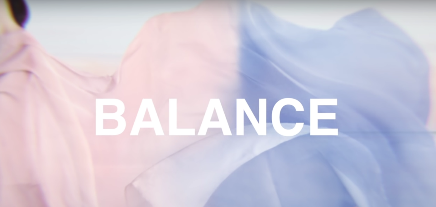
It’s indicative of these turbulent times that Pantone chose two colors, rather than one, to represent 2016. The colors they’ve chosen, Rose Quartz and Serenity Blue, are almost like opposite sides of the same coin. The pink and blue tones are soft and subtle and convey a duality that perfectly mirrors the blurring of many of our current perceptions.
Rose Quartz and Serenity Blue couldn’t be more dissimilar to the 2015 choice of Marsala with its heavy, solid rich jewel tones.
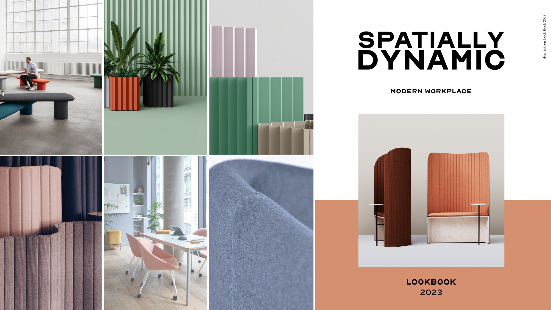
They’re light and airy, perfectly complementary and easy to love. They offer an inspiring palette that’s already influencing design decisions from fashion to interiors, from industrial to residential, from open plan office to collaborative spaces.
 It’s all about creating spaces that offer a respite from the hectic and frenetic pace of life to which we’ve become accustomed. It’s about taking a step back from all the pressure and relaxing the mind to allow ourselves to recharge and come back stronger.
It’s about encouraging meaningful, solid collaboration and strategic creativity.
We’ll be seeing a lot more of these colors and their various combinations and shades in modern office design as 2016 progresses. First in wall colorings, then in fabrics and accessories. While at first glance, the colors themselves may seem a little ethereal, a quick look at the Pantone pairing palettes gives you a good idea of their versatility and the huge scope for personalization. They work well with all kinds of other mid-tones including greens, purples, browns, yellows and pinks. If you like something with a little more sparkle, Pantone suggests adding a touch of silver or hot brights.


